Work
About
Fun Projects
Semrush, 2025
Redesigning Semrush Content: from fragmented tools to a unified AI workspace
A comprehensive redesign of the Content Toolkit, transforming scattered tools into a unified, intuitive content creation system for marketers at all levels.
TL;DR
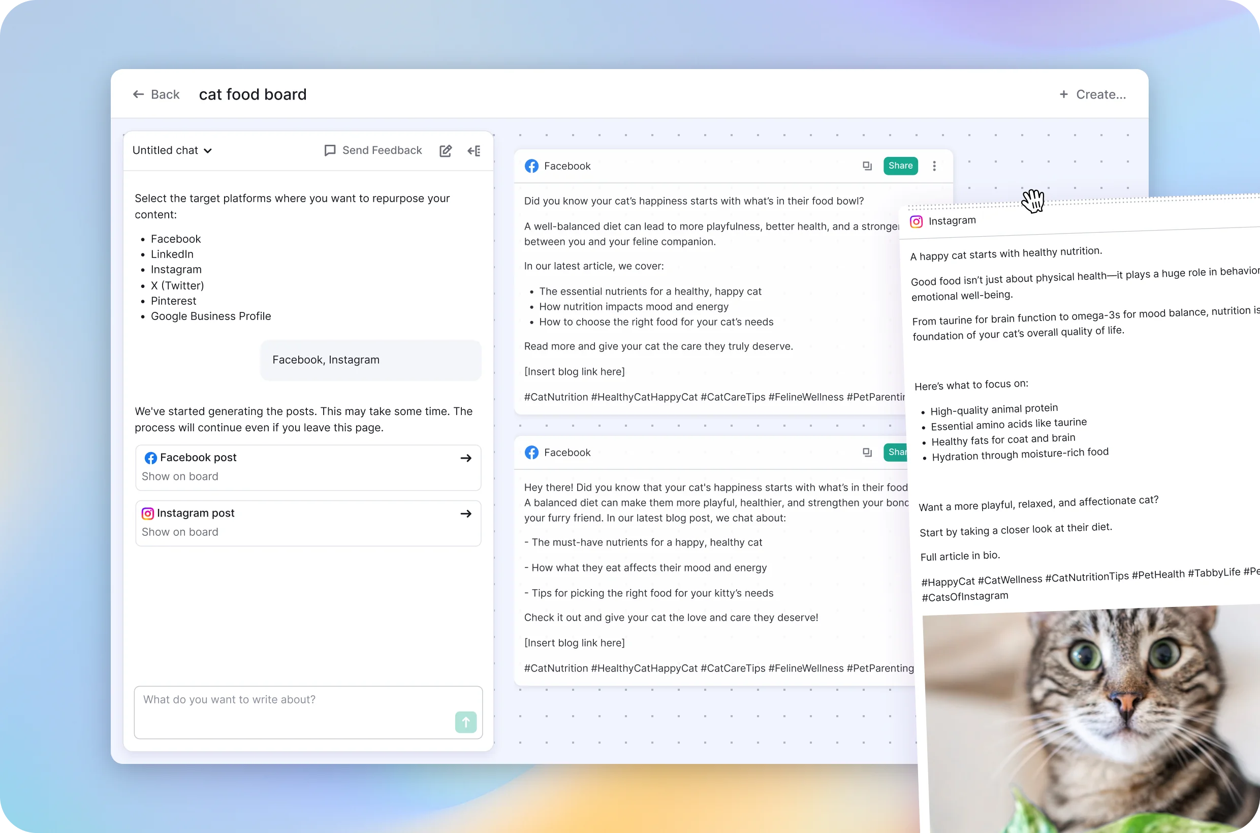
Semrush Content used to be a pile of disconnected tools — users spent more time figuring out which tool to open than actually creating anything. I led the redesign into one AI-powered workspace where you create, optimize, and repurpose content without ever leaving the flow. Result: people create more, come back more, and stop asking "wait, where do I do this."
My Role
I led the end-to-end design and discovery – from mapping user flows and collaborating on data, to designing a user-friendly experience for non-technical marketers, and evaluating performance post-launch.
Team
Product Owner, Product Designer (me), Dev Teams, UX Researcher
Product
Semrush Content is an AI-driven workspace for creating, optimizing, and repurposing marketing content.
Problem: fragmentation limited both user success and product scalability
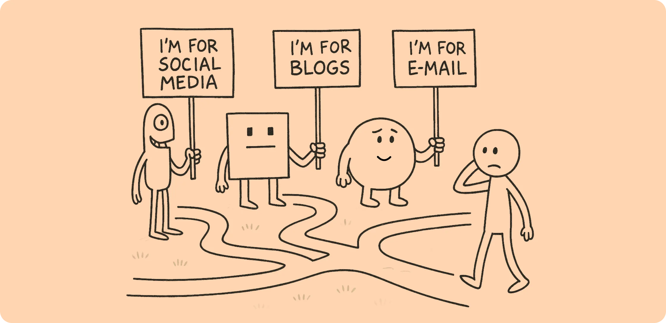
The existing Content Toolkit was a collection of separate tools that evolved independently over time. While each tool served a purpose, together they created a fragmented experience that confused users and slowed down their workflow.
Through user interviews and analytics, we identified several critical issues:
Users spent too much time navigating between tools, trying to understand which one to use when, and how different tools related to each other
- Inconsistent UX patterns made it hard to transfer knowledge between tools
- No clear entry points for different use cases
- Duplicated features across tools created confusion
- Poor discoverability of advanced capabilities
As a result, the fragmented experience didn't just affect usability –it directly impacted activation, short-term retention, and the ability to scale the product as a long-term value engine for the business.
Target Audience
The Content Toolkit is built for non-technical marketers, small business owners, marketing managers, and freelance creators who rely on digital content to grow but often lack SEO knowledge or editorial infrastructure. They need speed, clarity, and guidance — tools that help them act, not just configure. Our redesign aimed to meet those needs by making the experience more intuitive, proactive, and aligned with real-world content workflows.
Goal: Turn a fragmented content creation process into a unified, scalable, and proactive workspace
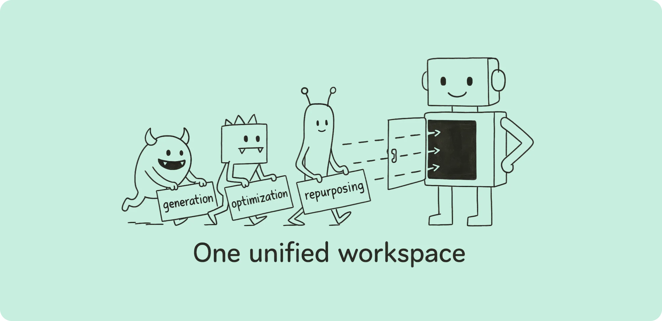
The main objective was to redesign the Content Toolkit into a single experience that connects content generation, optimization, and repurposing.
The redesign aimed to reduce friction, align tools around real user jobs, and enable faster time-to-value — especially for new users.
We also wanted to evolve the product from a static toolset into a continuous content creation ecosystem that supports the full lifecycle — helping users not only create but also refine, reuse, and optimize their work over time.
Success Criteria
Note: Specific target metrics are omitted due to confidentiality (NDA).
Our success was measured across user engagement, product adoption, and business outcomes, with a primary focus on growing the North Star metric — the median number of content pieces created per user.
● North Star Metric: increase the median number of created content pieces per active user — reflecting deeper engagement and sustainable product value.
● Adoption: new users quickly discover and start using key workflows (create, optimize, repurpose) within the first sessions.
● Activation: users complete at least one content job faster and with less friction — reaching an early "Aha!" moment.
● Retention: users return during the first and second weeks to continue working on existing content or start new pieces — supported by "My Content" and proactive nudges.
● Perceived Value: user feedback reflects improved clarity, guidance, and understanding of the product's full capabilities beyond content generation.
Key Challenges
| Challenge | My task |
|---|---|
| Fragmented experience across tools | I unified disconnected editors into one scalable workspace to reduce confusion and make content work feel continuous. |
| No clear entry point or structure | I restructured the flow around core jobs and lifecycle stages, giving users intuitive guidance and progress cues. |
| Undefined AI assistant behavior | I created scalable AI UX patterns that made the assistant feel proactive, useful, and human across content scenarios. |
| Solo design ownership after restructuring | I led the entire UX effort across surfaces and dev teams, from concept through delivery. |
| Need for stakeholder alignment | I presented user insights and defended the strategy to align leadership around a new direction. |
Solution & Decision Making
1. Identifying core problems and defining the new product shape
This was a design-first initiative, meaning the problem space and desired outcomes were initially shaped by the design team — based on a deep dive into user experience gaps.
At the start, I helped map and synthesize key issues using inputs from user feedback, product analytics, and earlier research.
We identified the most pressing pain points: unclear starting points, disconnected tools, and fragmented workflows that made content creation feel disjointed and hard to repeat.
These insights became the foundation for our product reframing — shifting the focus from isolated features to a unified, continuous content journey.
2. Validating the concept through collaborative prototyping and user testing
My role:
Led design concept and prototyping, built an AI-powered prototype for realistic testing; co-ran user interviews, and translated insights into design refinements and product hypotheses.
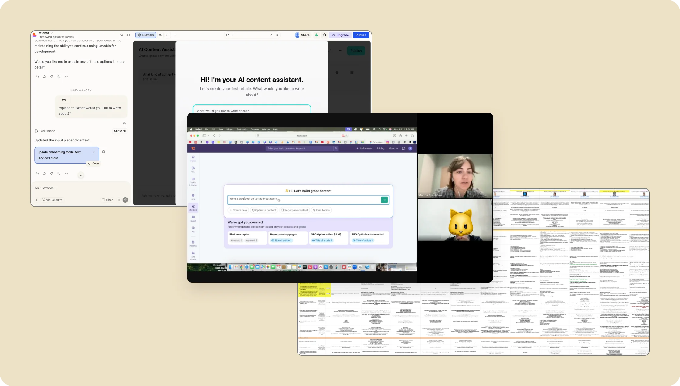
To validate the new unified experience early, our design team created a clickable Figma prototype that demonstrated the core flow of article creation with minimal friction. My focus was to ensure the prototype captured the "Aha!" moment we aimed for — a smoother, more intuitive experience powered by Semrush's unique strengths: enriched keyword data, personalized suggestions, and a more natural, conversational interaction model.
In parallel, I built an AI-driven prototype (linkedIn post) using Lovable and the OpenAI API. This version behaved almost like a functional product:
- It generated real responses based on users' inputs,
- Created more believable interactions,
- And made the testing experience significantly more immersive and realistic.
Along with the design team, I interviewed and conducted usability testing with 16 target users, covering core scenarios such as article creation, interaction with the "vibe-marketing" chat model, and the sufficiency of inputs for producing strong AI output.
Key research insights (summarized + NDA-safe):
- The unified canvas significantly reduced cognitive load and made the workflow feel more coherent.
- Users appreciated having guidance from the assistant early in the process and saw value in the semantic SEO signals.
- The prototype exposed several areas where clarity and control were needed — particularly around content tracking, project-level organization, and keyword transparency.
- Users expected stronger personalization and better handling of brand tone.
Having access to engaged users who voluntarily took part in our study was essential in uncovering their real needs and pain points. These insights helped us shape a redesign that balanced both business goals and user value.
3. Finalize design – working through all current flows taking into account insights after usability testing.
My role:
I led the final design phase end‑to‑end. Before moving into delivery, I presented and defended our research findings and insights to key stakeholders — aligning the team around the validated direction and ensuring we were designing for the right problems.
After the design team was reduced during restructuring, I took full ownership of the final UX across all flows. I designed the majority of the end-state experience independently and worked closely with two development teams, aligning implementation details, clarifying edge cases, and ensuring the final product matched the intended user value.
This phase included finalizing the below core areas.
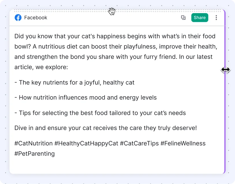
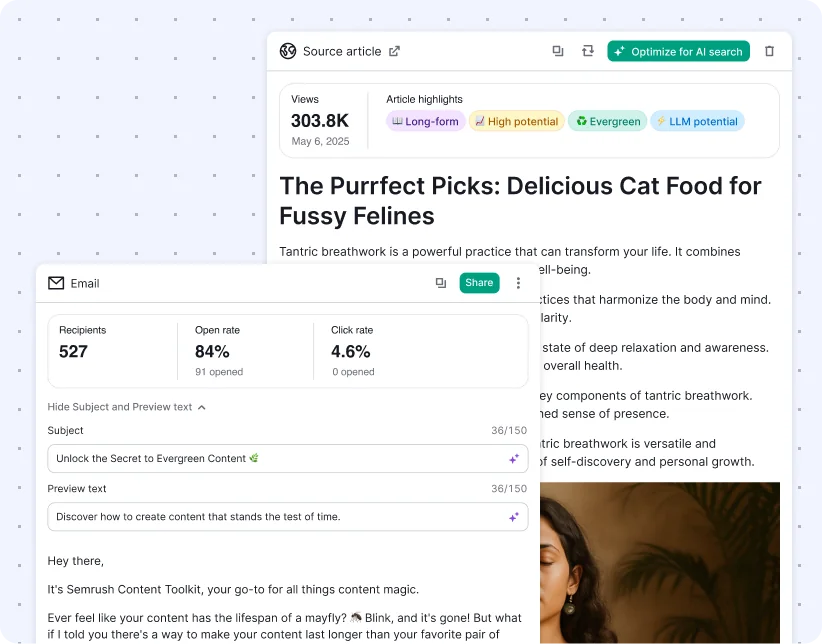
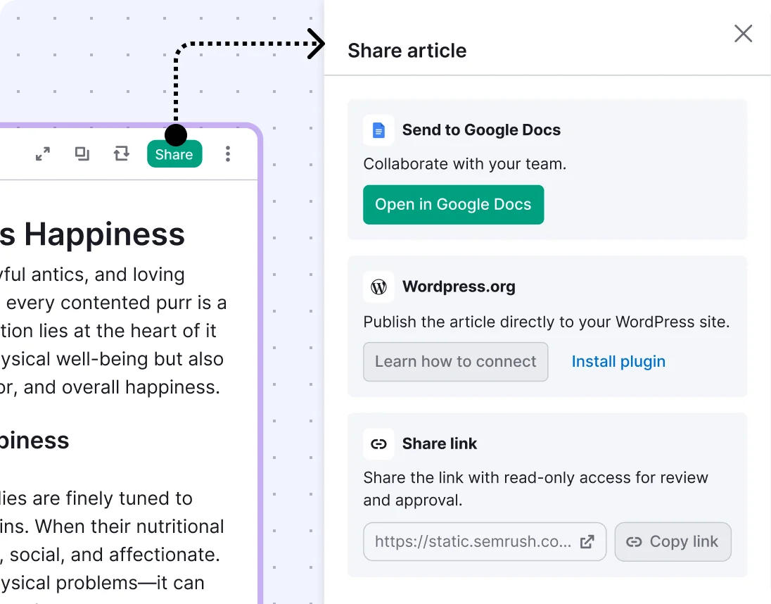
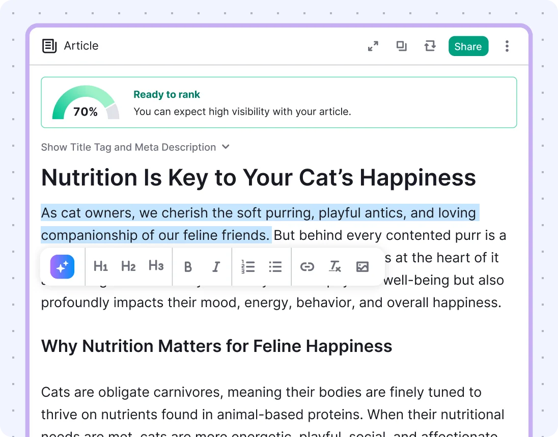
Board — a unified workspace for content creation, optimization, and repurposing
The Board allows users to:
- Generate various content types — blog posts, emails, and social media posts
- Seamlessly move through key workflows: creation, optimization, and repurposing
- Organize work using drag-and-drop grouping
- Maintain clear visibility into all active projects
User value: Gives users a sense of control and progress, with the flexibility to manage content the way they work.
Business value: Lays the foundation for multi-scenario engagement and supports future scale of content types.
AI Chat & Agents — the new proactive starting point
The AI-powered chat became the primary entry point for content creation — designed to feel conversational, intuitive, and outcome-driven.
I led the UX logic for the assistant across key content marketing scenarios — from long-form generation to repurposing and optimization. Each agent was tailored to guide the user through a specific job, removing friction and supporting faster outcomes.
To ensure consistency and scalability across use cases, I also developed and documented the core AI UX patterns that define how the assistant thinks, behaves, and communicates.
This included a deep exploration of assistant logic and user experience across all supported scenarios — resulting in a more proactive, human-like, and trust-building interaction model.
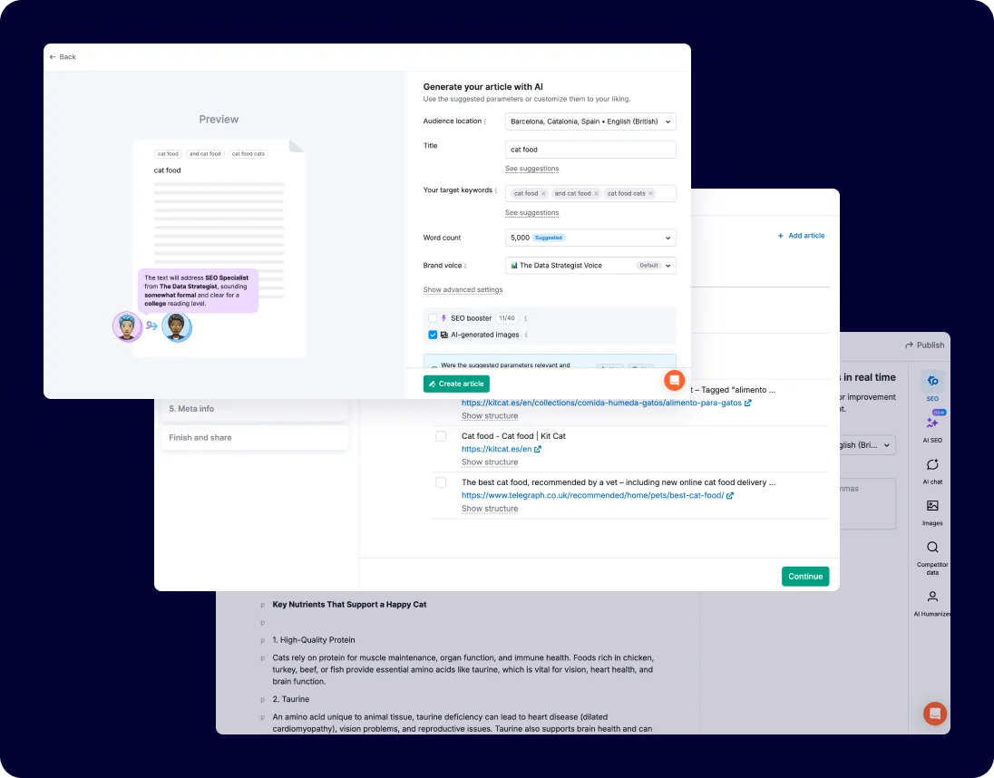
Before: To create an article or social post, users had to navigate separate editors — each with its own structure and onboarding. There was no continuity between content types: finishing one piece meant exiting the editor and figuring out how to start the next one elsewhere. This disjointed experience led to confusion, inefficiency, and steep learning curves.
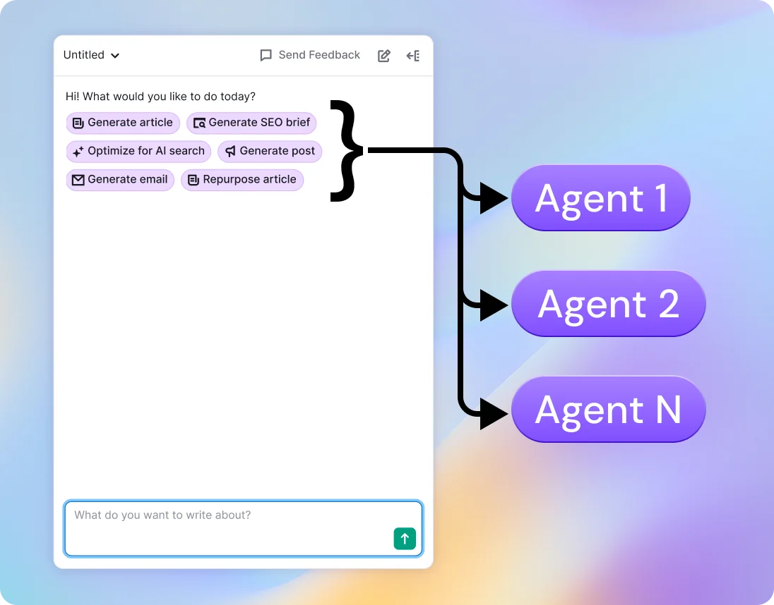
After: Now, every flow starts and ends in the same place — through AI Chat. Once a user finishes an article, they can instantly request a follow-up post or email, and continue working within the same Board space. I designed and mapped the logic behind this assistant-led workflow, defining how the chat interacts across use cases and how each agent responds to real user tasks. This shift removed friction, created continuity, and laid the foundation for scalable content workflows.
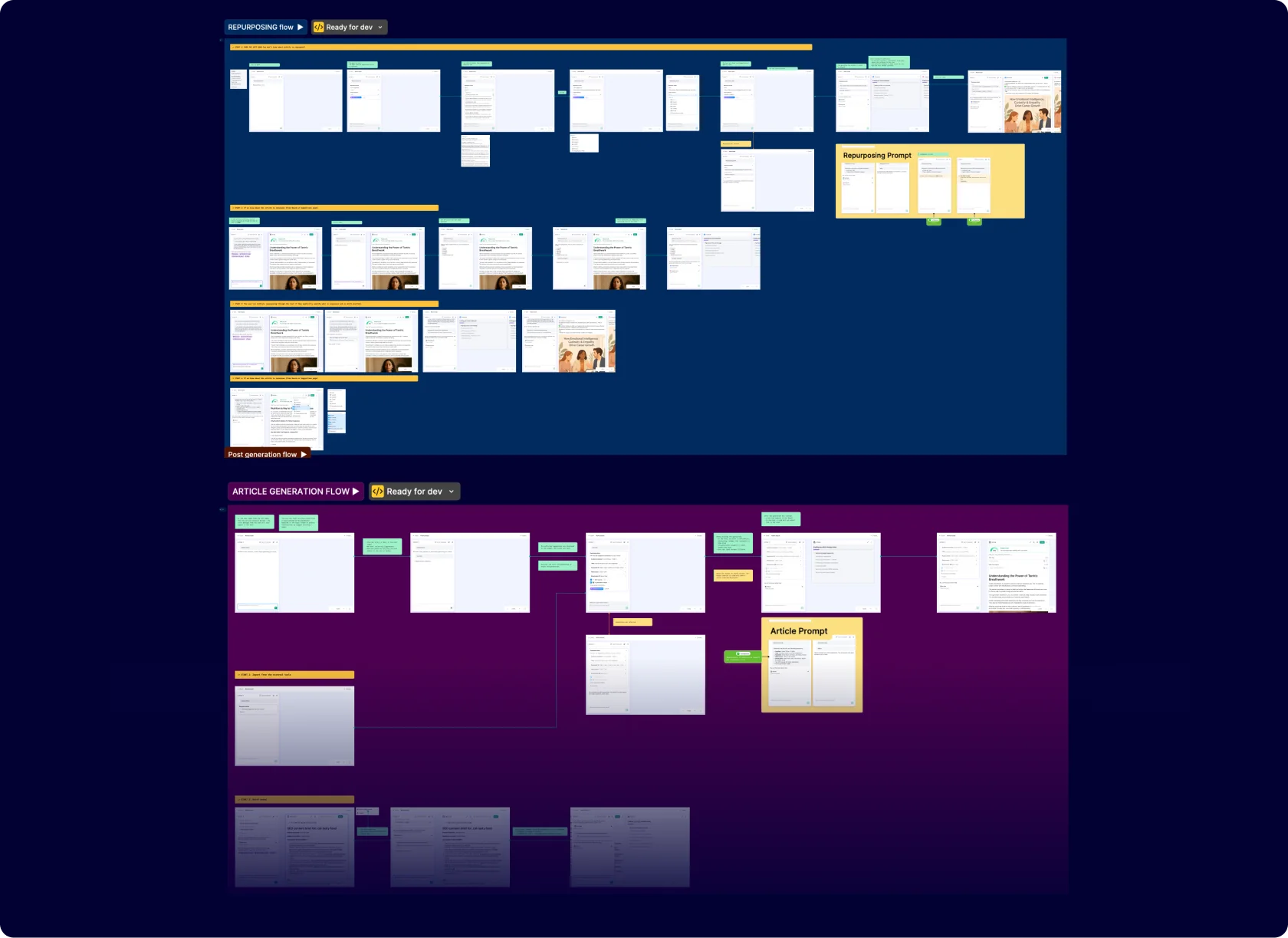
The assistant experience was grounded in a set of core UX – including stream of thought reasoning, contextual nudges, parallel multi-chat support, persistent memory across sessions, seamless mode switching, and resilient fallback logic – ensuring scalable, intuitive, and human-like interactions.
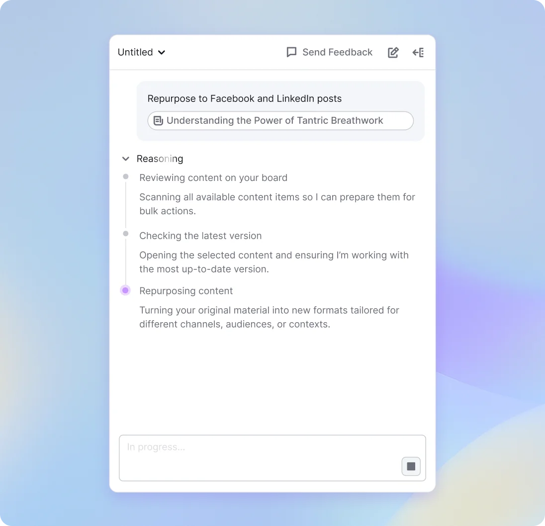
Stream of thought responses – step-by-step reasoning to make generation more transparent.
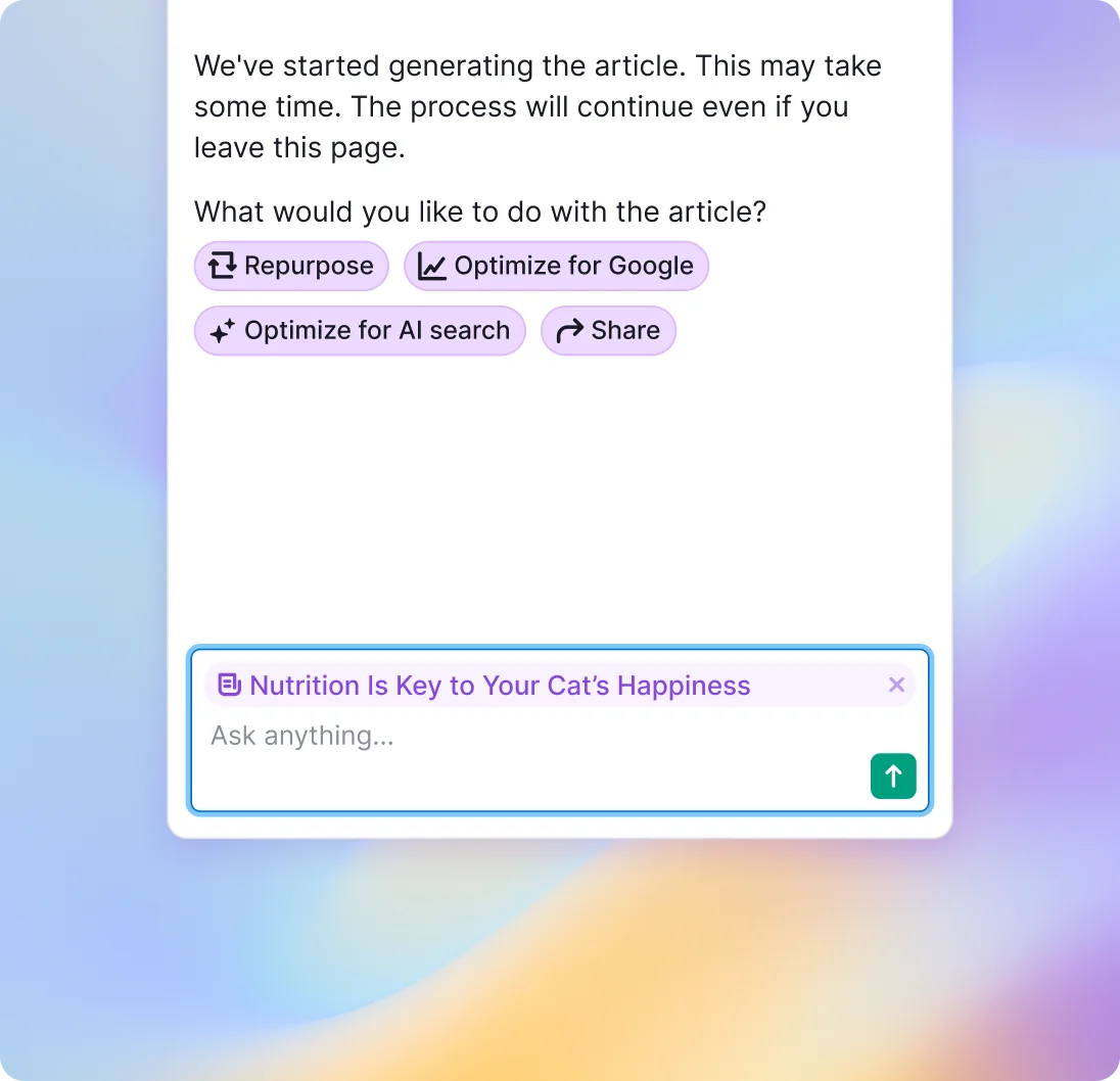
Contextual nudges – timely prompts based on content type and current state.
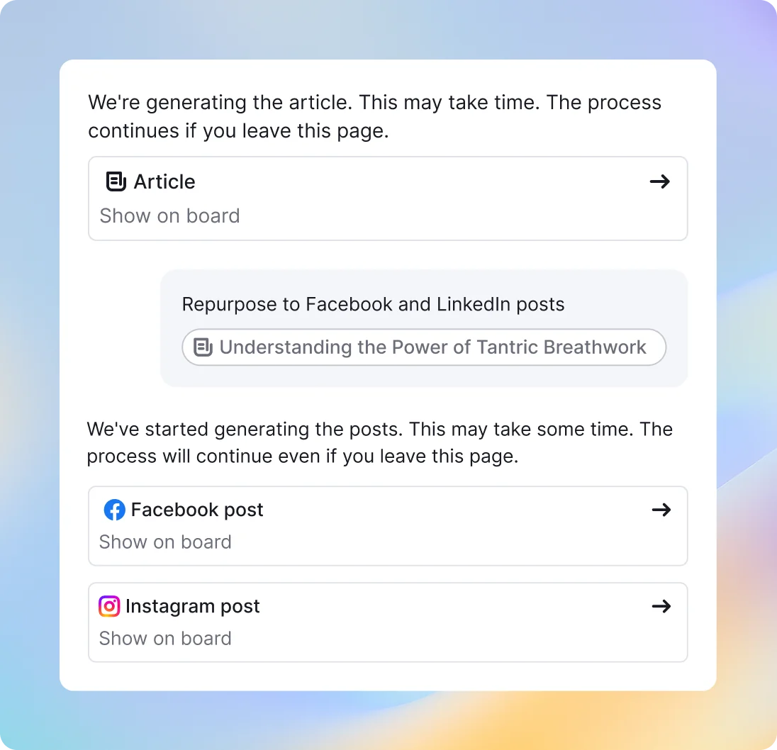
Users can work on multiple content pieces at once while the assistant seamlessly remembers relevant information across steps and sessions.
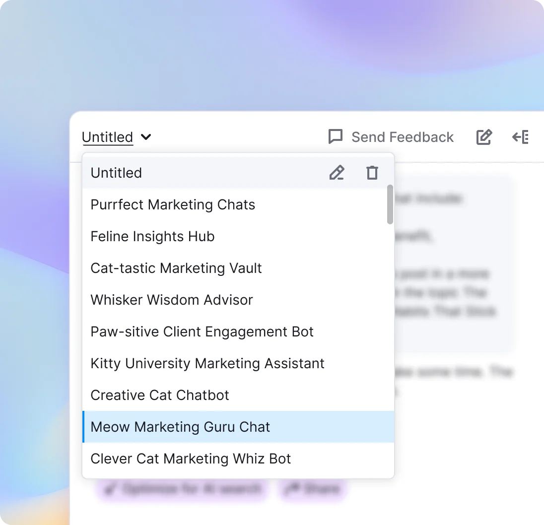
Users can create and manage multiple assistant chats in parallel — each focused on a different content project or task.
Redesigned dashboard — reconnecting users to their content journey
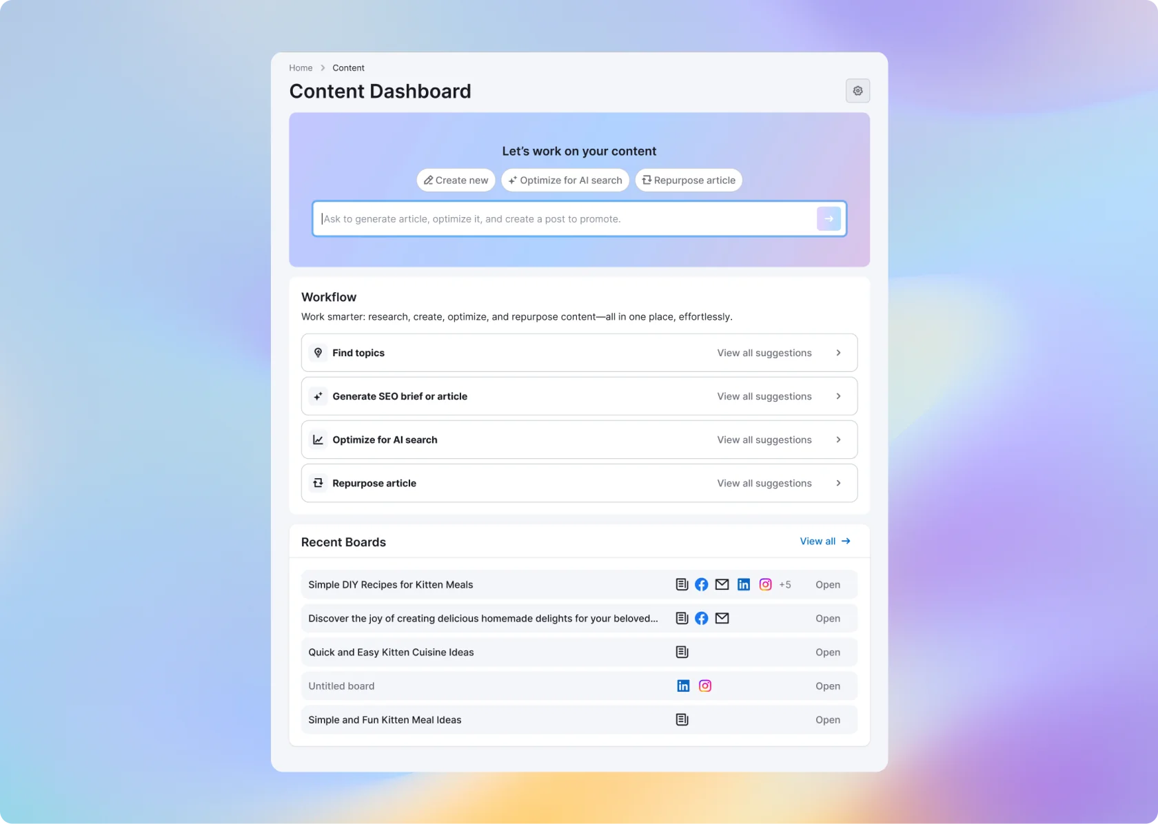
I designed the new dashboard to re-engage users and guide them toward meaningful next steps — transforming content creation from a one-off task into a continuous, proactive flow.
User Value: Gives users clarity, focus, and a sense of momentum — making it easy to start, continue, or expand their content efforts. Show them where they are in the content lifecycle.
Business Value: Drives activation, feature adoption, and repeat usage by turning the dashboard into a habit-forming launchpad for core scenarios.
Results: fragmented tools → one workspace people actually stick with
Validation's done. Numbers and user feedback both point the same way: it worked.
- North Star – content pieces per active user. +20%. People aren't just opening the tool — they're finishing things and coming back for more.
- Adoption. +10% of new users try create/optimize/repurpose in their first session. "Which tool do I even open" – gone.
- Retention. +10% of users return within 2 weeks to keep building. The dashboard is doing its job — habit, not one-off task.
- Perceived Value. Fewer "which tool do I even use" comments. More users stumbling onto advanced features on their own — without us explaining it first.
Numbers are directional per NDA — but every one of them moved the right way.
Hey, let's chat!
Telegram